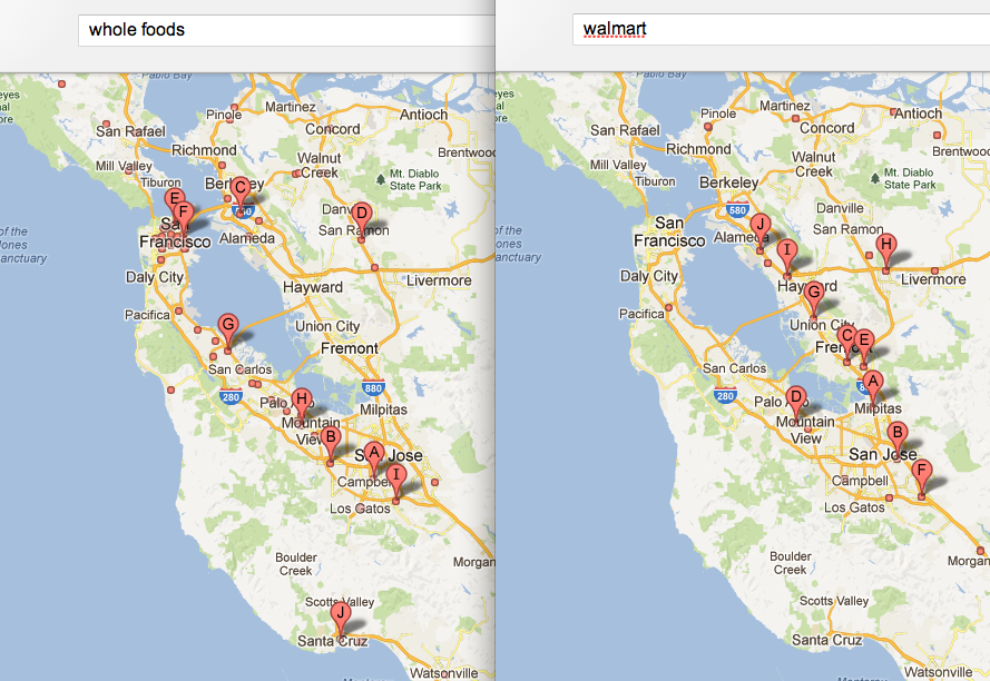
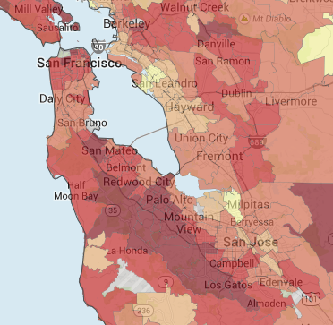
Playing around with Google Maps tonight I noticed by searching for two of the world’s most popular brands, Whole Foods and Walmart and comparing it to home prices, it paints a very clear picture of who the brands customers are.
The darker the colors on the map below the higher the house prices.
I have a feeling we’d fine this same scenario in many other cities across the US.


